
Dear Investors,
Over the past few days, I’ve found myself digging deeper into a question I often return to when things seem too calm on the surface: What if the strength we’re seeing in markets is only skin-deep?
Because the more charts I read, the more earnings reports I dissect, and the more macro signals I follow – the more I begin to feel like we’re walking through a familiar illusion.
One where the façade of bullishness is bright and convincing, yet behind it all, there’s a mounting fragility that doesn’t get the same headlines.
A narrow rally masking a broader weakness
At a glance, the US equity market seems invincible.
The S&P 500 has just overtaken the Stoxx Europe 600 in local currency terms, reaffirming its dominance.
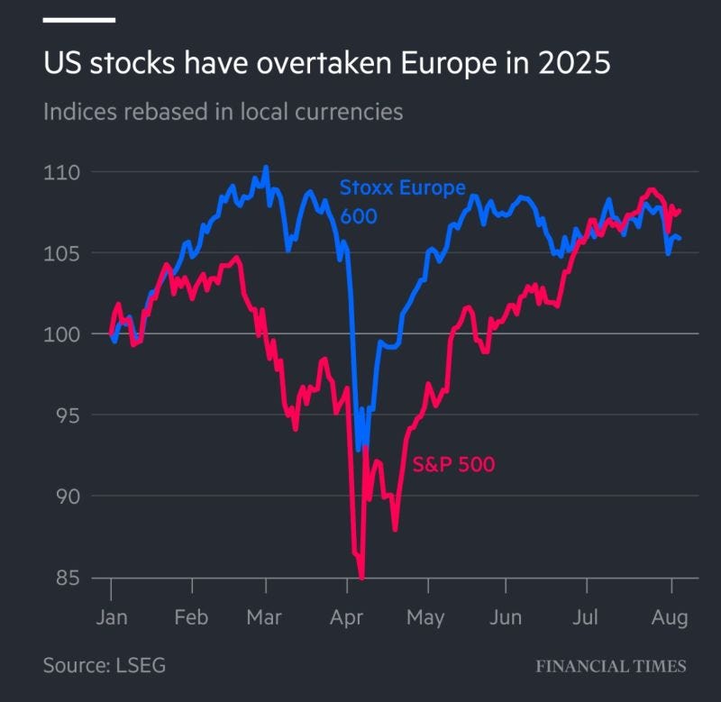
Some of the biggest names in tech have delivered robust earnings, giving the index a boost and giving investors a renewed sense of confidence.
The numbers are compelling: S&P 500 earnings are up 9% y/y, while more than half of companies in the European benchmark are showing no earnings growth at all.
But as I peel back the layers, the shine begins to dull.
In truth, more than 490 companies within the S&P 500 have been stagnant.
This isn’t the rising tide we like to imagine – it’s more like a few massive ships pulling the average higher while the rest remain moored.
It’s eerily reminiscent of the late 1990s, when the Nasdaq-100 posted triple-digit returns in a single year, while equal-weight indices barely moved.
We all remember what followed: the bubble burst and valuations crashed.
That period serves as a cautionary tale about what happens when market strength is concentrated in a narrow group.
The structure of this rally matters. It tells us that while index levels may look healthy, market breadth – the true indicator of strength – is weak.
Momentum might carry us further for a while, but the weight of this imbalance has a history of breaking down when reality reasserts itself.
Global dominance – or late-cycle illusion?
Let’s zoom out. The United States now accounts for an astonishing 72.5% of developed world equity market capitalization.
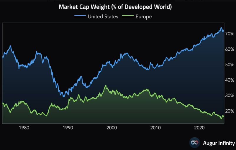
Europe, by contrast, holds just 16.1% – the lowest share in modern history.
To give you some perspective, in 2007 the US represented only 42% of global developed equity weight. Back in 1989, the US and Europe were nearly equal.
Today, the imbalance is staggering.
But this divergence isn’t just about performance. It’s also driven by the strength of the dollar and capital inflows into US assets – especially tech.
From 2009 to 2023, the S&P 500 delivered a return of +515%, while the Stoxx Europe 600 offered a far more modest +145%.
And this gap widens further when you account for the EUR/USD falling from 1.60 to 1.05 over the same period.
For European investors, it wasn’t just underperformance – it was compounded pain.
This all begs the question: are we witnessing a true shift in global economic leadership, or are we seeing the late-stage effects of a liquidity-fueled, US-centric market cycle?
When I line up the data, the historical parallels, and the sentiment – it feels less like a new beginning and more like an endgame unfolding in slow motion.
Rates, rotation, and the real story told by gold
The next piece of the puzzle comes from monetary policy. I’ve tracked these transitions before – and they tend to follow a similar path.
When the Federal Reserve begins a rapid easing cycle, something important happens beneath the surface: the Equal Weight S&P 500 starts to outperform the Cap Weighted version.
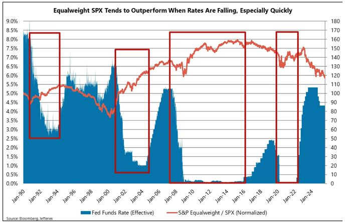
It’s happened in 2002, again in 2009, and most recently in 2020.
These moments signal something deeper – a shift in leadership, a return of breadth, a rotation toward the parts of the market that had been left behind.
And there’s more. During the first six months of a Fed rate-cutting cycle, the 10-year Treasury yield historically falls by 80 to 150bps.
That’s not just a bond market story – it sets off a domino effect: the dollar weakens, gold gains strength, and mid- and small-caps begin to shine.
That’s why I always keep an eye on gold during these transitions.
Since 1971, when the dollar was decoupled from gold, the metal has surged from $42.22 per ounce to over $3,300.
That’s an 8.49% compound annual growth rate – far exceeding CPI-based inflation measures.
It paints a more honest picture of the dollar’s true loss in purchasing power. In that same window, from 2000 to 2023, gold returned +560%, while the S&P 500 (excluding dividends) returned +230%.
When real interest rates dip into negative territory, gold tends to shine – and it’s no coincidence.
Now layer in the lived reality for households. Rents have surged 30%.
Groceries and utilities? Up 25%. Insurance costs are nearly 50% higher. Credit card debt is at historic highs.
While equity markets break new records, many families are breaking under the weight of basic expenses. It’s this chasm – between asset prices and real-world affordability – that truly worries me.
When markets no longer reflect the lives of the people they’re meant to serve, distrust builds. And from distrust often comes volatility.
So what comes next? The signs to watch
The disconnect we’re witnessing is becoming harder to ignore. Indices are climbing, but the foundations beneath them are shifting.
From earnings concentration to labor market softness, from real inflation to central bank uncertainty – the signals are clear.
Something is changing.
Momentum can be a powerful force. It can keep markets elevated longer than logic might suggest.
But history teaches us that when prices detach too far from fundamentals, the adjustment isn’t gentle – it’s swift.
I’m watching Powell’s next speech – especially what he signals at Jackson Hole. I’m tracking the shape of the Treasury curve, looking for steepening.
And I’m closely observing whether Equal Weight indices begin to quietly outperform, a sign that capital is starting to flow back into the broader economy.
As always, I won’t just bring you data – I’ll bring you insight. Because in moments like these, what matters most isn’t simply what moves.
It’s why it’s moving – and where it might go next.