

Dear Investors,
There are weeks when the market feels like a machine, and there are weeks when it feels like a mirror.
A geopolitical shock hits the tape, energy prices jump, narratives spread faster than facts, and suddenly every portfolio, every conviction, every time horizon gets tested at once.
In moments like this, I always remind myself of something simple but important: when uncertainty rises, the market doesn’t just price information – it prices emotion, positioning, and forced behavior.
That is why, this week, I didn’t want to write you another headline-driven note.
I didn’t want to pretend certainty where certainty doesn’t exist. I didn’t want to build a full macro thesis on news flow that may look different in twelve hours.
Instead, I wanted to do what I believe creates real edge for us as investors: go back to the charts, respect the sequence, and let the cross-asset story emerge.
I reviewed the charts I’m going to share with you today, and the more I looked at them together, the clearer the message became.
To me, they aren’t showing nine separate observations. They are showing one connected narrative. An energy shock is creating a near-term inflation pulse. That inflation pulse is contributing to a tactical dollar squeeze. The dollar squeeze is colliding with crowded positioning. And all of this is happening while a much larger global equity rotation is quietly unfolding beneath the surface, at the exact same time that the US bull market enters a more mature, more selective phase.
The short-term move is loud. The structural transition is quieter. But both are real, and both matter.
The shock begins with energy
I want to begin where I always try to begin in a week like this: with the most basic economic transmission mechanism.
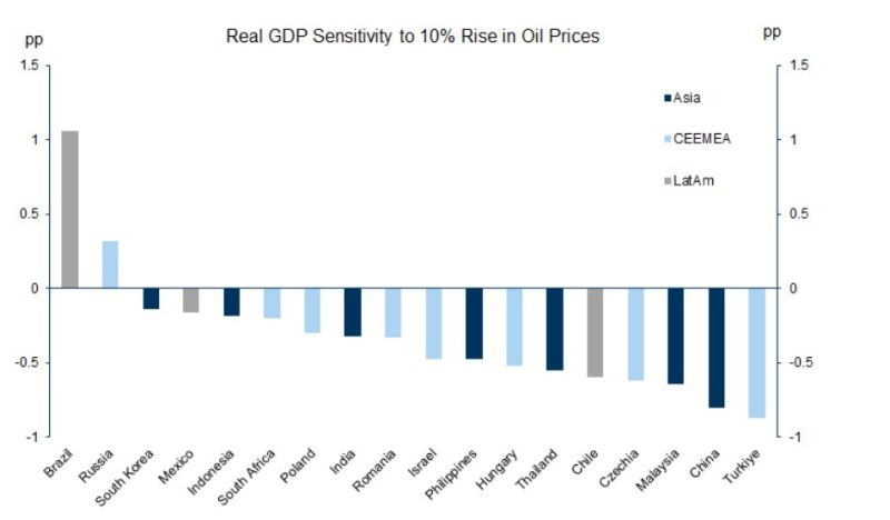
The Goldman chart on real GDP sensitivity to a 10% rise in oil prices is, in my view, the right foundation for everything that follows because it immediately forces us to move beyond lazy labels.
I often hear investors say that emerging markets are “commodity-heavy,” and therefore a rise in commodity prices should be broadly positive for EM.
But the chart tells a more intelligent story. A 10% increase in oil prices still acts as a negative growth shock for a large share of the emerging world.
That isn’t a contradiction. It is macro reality.
Yes, many EM economies are linked to commodities, but many of them also consume commodities intensively relative to GDP, and they are often more exposed to the indirect consequences of an energy shock than the headline narrative suggests.
A rise in oil doesn’t only affect trade balances. It tightens financial conditions, pushes inflation higher, weakens consumers, raises uncertainty, and slows external demand.
In other words, even in countries with commodity exposure, the second-order effects can overwhelm the first-order benefit.
What matters even more to me is the dispersion across countries.
Brazil and Russia stand out as notable exceptions, and that is a critical reminder that “EM” isn’t a macro position by itself. It is a basket of very different economies with very different sensitivities, trade structures, currencies, and policy constraints.
In past energy shock windows, I have repeatedly seen this dispersion appear first in FX and local rates, not in equity indices.
Oil-importing EM currencies have often weakened by around 3% to 8% over the following 1-3 months, while commodity-linked FX has tended to hold up materially better.
Local bond markets, meanwhile, start pricing the inflation-growth tension before equity narratives fully catch up.
That sequencing matters for us because it tells us where to look first when the shock is still fresh.
If oil remains elevated for more than a few sessions and starts behaving like a regime rather than a spike, I would expect the market to continue widening the gap between oil beneficiaries and oil importers inside EM.
I don’t think that divergence gets priced all at once. It usually unfolds in layers – currencies first, then rates, then earnings revisions, and only later the broader equity narrative.
This is the first key lesson of the chart pack for me: when oil moves, the real question is not “who produces commodities?” The real question is “who can absorb the shock?” That is where the performance gaps usually come from.
From commodities to inflation expectations
Once I move from the Goldman chart to the BCOM versus US 10-year breakevens chart, I feel like the regional story becomes global almost immediately.
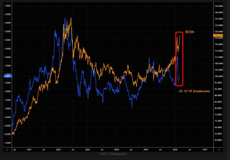
The Bloomberg Commodity Index (BCOM) has moved higher aggressively, but US 10-year breakevens have not fully followed.
When I see a gap like that, I don’t interpret it as a curiosity. I interpret it as a tension the market is unlikely to tolerate for long.
In energy-led inflation regimes, broad commodities and breakevens have usually maintained a fairly strong positive relationship, often in the +0.6 to +0.8 correlation range on rolling windows.
We saw this dynamic in 2020-2022, when commodities surged and inflation expectations eventually repriced higher.
We also saw the mirror image in 2014-2016, when weaker commodity prices were associated with a meaningful compression in breakevens.
So the way I read the current divergence is very simple.
Either breakevens eventually catch up, or commodities retrace and the market decides the shock is temporary. In previous episodes when the market came to believe the commodity move was persistent rather than transitory, breakevens often repriced by something like 20 to 50bps.
I’m not saying that exact move must happen now, but I’m saying this kind of gap tends to resolve – and when it resolves, the consequences usually spill well beyond inflation commentary.
Because this isn’t only an inflation chart. It is also a chart about duration risk, real yields, and equity leadership.
If breakevens rise while real yields remain relatively contained, the market can digest the move in one way. If breakevens rise while real yields rise too, the pressure on duration-sensitive assets becomes much more immediate. And in a market where so much has been built on assumptions about rate stability, that distinction can matter a lot.
This is why I’m careful with “all-clear” narratives whenever commodities are moving this quickly. A commodity chart can look like a side story right up until it begins to reshape the way the market prices inflation persistence.
And from there, it is a very short step into currencies.