


Dear Investors,
Markets are a conversation.
Most days, I just listen. Oil says something, bonds answer, stocks nod along.
On Wednesday, at 11:20 New York time, the conversation stopped.
Oil was falling. The 10-year should have followed it down, as it has done for a year.
Instead, it turned its back and kept climbing, to 5.29%. On Tuesday, it had done exactly the same thing.
Once is noise. Twice is a message.
And I’m fairly sure I know who sent it.
2 weeks ago, I told you that if oil slipped below $100, 8,000+ on the S&P would become my base case.
Oil didn’t just slip. WTI is now below $90.
And yet the 10-year closed September at 5.30%, its highest level since April 2002.
The market met my condition and refused the outcome. So this morning, I’m redrawing the map.
Then came payrolls: +29K against +90K expected. The futures cheered. I didn’t.
Because the last 2 times yields, stocks and commodities lined up the way they are lining up now, the years were 2000 and 2007. Both times, 3 dominoes fell in exactly the same order.
The first 4 charts below are the ones you could have found yourself this week. They tell you what happened.
Read them, and you’ll close this email informed.
But informed isn’t positioned.
The real analysis begins with chart 5, in the PRO section.
That’s where I explain why the bond market stopped listening to oil, and who I believe is really pushing yields up.
Where a number I found 2 weeks ago walks back in through a completely different door.
And where I lay out the sequence of 2000 and 2007, with the dates it points to for us.
I’ll be honest: I don’t like what the sequence says.
I’d rather you hear it from me now than from the market in 3 months.
So let me start where the story started: with a barrel of oil.
🛢️ The G7 opened the tap. Oil fell through the floor
Some charts whisper. This one slams a door.
Look at the right edge. WTI drops from about $92.70 to $89.10 in a handful of candles, roughly -4%, the instant the headlines say Europe will open its reserves.
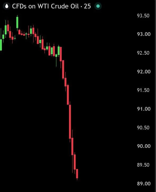
The G7 will release up to 100 million barrels of oil and diesel over 4 months, through the IEA. I ran the math on a napkin: about 830,000 barrels a day, roughly 0.8% of global demand.
Washington asked for 120 million barrels of diesel, more than 40% of the EU’s emergency stock. Paris answered with 50 million of diesel and 50 million of crude, about 17%.
Washington gets its headline before the midterms. Europe gets the bill.
I’ve watched this film before, and I know how it usually ends.
In June 2011, the IEA released 60 million barrels. Brent fell about 6% in a day, and was back above $115 3 weeks later.
In spring 2022 came the largest release ever, 240 million barrels, with WTI near $100. On June 8 it printed $122, while the S&P lost 19% and USD/JPY climbed from 122 to 136.
Between 2014 and 2016, WTI collapsed from $107 to $26, and USD/CAD rose from 1.06 to 1.46.
Releases move oil for weeks. Only structural shifts move petro-currencies for years.
If USD/CAD doesn’t break higher, this is relief, not regime change. I wouldn’t be surprised by $85, nor by $95 again before the release ends in February 2027.
But oil isn’t the protagonist of this chart.
The protagonist is what didn’t follow it down. I’ll introduce you in chart 5.
First, I want to show you what the Fed’s own history says about where we are.
🏛️ Every hiking cycle since 1994 drew blood. The dollar decided how much
5 hiking cycles since 1994. 5 drawdowns. An average of about -15%, after an average of 330 bps of hikes.
We are 25 bps into this one.
The smallest cycle, 175 bps in 1999, hurt more than the 425 bps of 2004.
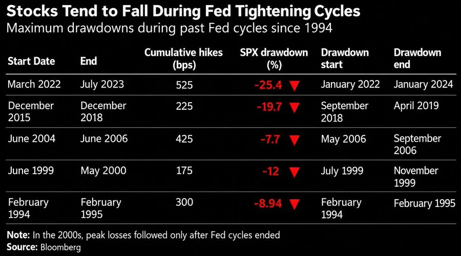
If the size of the hikes doesn’t decide the damage, what does?
I found the answer in a column Bloomberg didn’t print: the dollar.
In 2022-23, the S&P lost 25.4%, the 10-year went from 2.15% to 4.99%, and the dollar index reached 114.8, pushing EUR/USD to 0.95.
In 2015-18, the S&P lost 19.7%, the 10-year hit 3.24%, the dollar gained 11% from its February 2018 low, and USD/CNY went from 6.27 to 6.97.
In 1999-2000, the S&P fell 12%, while EUR/USD collapsed 20%, from 1.04 to 0.83.
In 1994, the 10-year exploded from 5.8% to 8.0%, yet the S&P lost only 8.9%, with USD/JPY down 9%.
In 2004-06, the S&P lost just 7.7%, the 10-year barely moved to 5.1%, and EUR/USD rose from 1.21 to 1.27.
When the dollar rallied, the average drawdown was -19%. When it weakened, -8.3%.
The Fed sets the pace. The dollar sets the damage.
And there’s a footnote I’d frame on my wall: in the 2000s, peak losses came only after the Fed stopped.
After the last hike of May 2000, the S&P lost 49%. After June 2006, 57% from its 2007 peak.
The hikes didn’t break the market. The silence after them did.
So this morning, when the market priced a 71% chance of no hike in October, and Nasdaq futures, gold and Bitcoin jumped, I felt the opposite of relief.
Which way the dollar breaks decides this cycle, and I think I know where to look.
Not in Washington. In Tokyo.
But before Tokyo, I need to show you how thin the ice under equities has become.
⚖️ The cushion is gone. Now it’s negative
2 weeks ago, I told you the cushion under equities had worn down to roughly zero.
Today, it has gone through the floor.
The 10-year yields 1.47 points more than the S&P 500’s earnings yield, the widest gap since 2002.
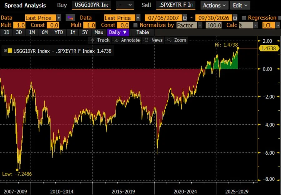
Picture 2 counters, side by side.
At the first, every $100 buys you about $3.80 of earnings, with an earnings season attached. At the second, the Treasury hands you $5.29, guaranteed.
I read this chart as a 10Y return map, and history reads it with almost uncomfortable honesty.
The last time the spread sat in positive territory, between 2000 and 2002, the S&P went on to return about -1% a year for a decade, dividends included. US bonds returned about +6% a year.
The dollar index peaked near 121 as capital chased US yields, then lost about 40% by 2008.
At the other extreme, in March 2009, the spread hit -7.25. The S&P went from 676 to 3,386 by February 2020: +400%.
In March 2020, it was near -6, and the S&P gained 114% by January 2022.
There’s a way to turn this gap into a precise index level. I did the math, and the number that came out was one I’d already met 2 weeks ago.
It’s waiting for you in chart 8.
But first, growth blinked.
📉 The growth pillar just lost 1.3 points in a week
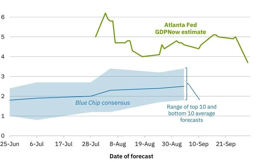
The Atlanta Fed’s GDPNow estimate for Q3 fell to 3.7%, from 5.0% on September 25.
-1.3 points in 7 days. And -2.5 from the early-August peak near 6.2%.
In fairness, 3.7% is still above the most optimistic Blue Chip forecasters, around 3.4%, and well above the 2.5% consensus. Growth isn’t collapsing.
But markets don’t trade levels. They trade direction. And the direction just changed.
This morning, the labor market said it out loud.
Payrolls rose +29K against +90K expected. Unemployment hit 4.2%, already above the Fed’s year-end projection of 4.1%.
Wages grew 3.0%. Against core PCE at 3.4%, that means real wages have just turned negative.
The print sent me straight back to August 2, 2024.
That day, payrolls came in at +114K against +175K, and unemployment rose to 4.3%.
In 3 sessions, the S&P lost 6% and the Nasdaq 8%. On August 5 alone, the Nikkei crashed 12.4%.
The 10-year fell from 4.03% to 3.78%, and USD/JPY dropped from 150 to 141.7 as the yen carry trade unwound. 7 weeks later, the Fed cut by 50 bps.
Logic says weaker growth brings yields down.
On Wednesday, with oil falling and growth fading, the bond market looked at logic and said no.
Why it said no, who is behind it, and what it means for the index level I found twice in 2 weeks: this is where I stop describing and start explaining.
Turn the page. This is where the real value of this analysis is.
Everything above is what happened. Everything below is what it means, and what I’m doing about it.