
Dear Investors,
On Tuesday night I laid 10 charts across my desk: Goldman, Fidelity, Bloomberg, Azuria.
Different data, different methods, people who don’t talk to each other.
I was sure they would talk about 2007. That’s where the 10-year yield had just dragged me: 5.17%, its highest since June 2007, after +70 basis points in a single quarter.
They didn’t say a word about 2007.
Chart after chart, they took me further back.
To the dot-com concentration. To the 1994 bond massacre. To a stock-yield relationship I hadn’t seen since 1997. To an oil-rate link this tight for the first time since 1985, the year Washington decided to break its own currency on purpose.
What unsettled me wasn’t the decade. It was remembering that the 1990s had 2 endings, and that they couldn’t have been more different.
In 1994, yields exploded, stocks went nowhere, and then the S&P gained 34% in 1995.
In 1999, yields rose into a concentrated, euphoric market, and the S&P went on to lose 49%.
Same decade. Same starting point. Opposite outcomes.
Last week I asked you: 2015 or 2022?
This week’s question is sharper, and the most important I’ve written this year.
1994 or 1999?
The first 5 charts describe the storm.
You’ll also walk away with a number: a zone on the S&P 500 that kept appearing no matter which method I used.
But those 5 charts can’t tell you which ending we’re in. They weren’t built to.
That answer lives in the PRO section.
It’s where I discovered why gold is ignoring a rule that governed it for 20 years. Why Washington is trapped in a corner it has escaped only 2 times in 85 years. And why oil, yields and stocks have quietly become a single trade.
It’s also where I give you my 3 levels and my odds.
At the end of every chart, I’ll leave a door ajar. After chart 5, I’ll walk you through every one of them.
Let’s start where everything still looks fine.
🫧 The index is celebrating. 1 stock in 2 isn’t
Picture a party where the music is loud, the lights are bright, and nearly 1 guest in 2 is quietly heading for the exit.
That’s the S&P 500 today, at 7,708, about 1% below its record.
This Goldman chart counts how many S&P 500 stocks are moving against the index. In a healthy market, that’s 0-5%.
At the peak of the dot-com bubble, the 3-month measure reached about 18% and the 1-year 14%.
Today the 3-month measure is at roughly 44%, almost 2.5 times the 2000 peak. The 1-year is at 20%, already above the dot-com high.
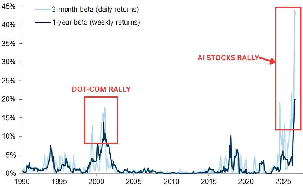
Nearly 1 stock in 2 is dancing to a different song.
The DJ is easy to spot. The top 10 stocks weigh about 40% of the index, against 27% in March 2000.
Most of them move to the same beat, AI, and at that weight they can carry the other 490 to a record almost on their own.
The other 490 face a 10-year above 5%, oil above $100, a firmer dollar and rising borrowing costs.
In 1973, the “Nifty Fifty” were stocks you bought and never sold. By October 1974, the S&P had lost 48%, the 10-year had climbed from 6.4% to 8.0%, and only energy and gold offered shelter.
In 2000, the S&P lost 49%, the Nasdaq 78%, and the 10-year collapsed from 6.8% to 3.1%.
But the detail I can’t forget is another one.
In 2000 alone, small value stocks gained 22.8% while large growth lost 22.4%. A 45-point gap in 12 months.
When narrow markets broke, the forgotten stocks didn’t follow the leaders down. They took the stage.
AI earnings are real, +28% Y/Y, and I’m not calling for 2000. But a market carried by 10 names has 10 points of failure.
So which of the 490 could take the stage this time?
The answer hides in a correlation from 1997. This chart comes back in the PRO section, with a twist I didn’t see coming.
📈 The bond market stopped asking for permission
Each bar is an entire quarter.
This one opened Q3 at 4.465% and is closing at its high, 5.162%: +15.7% in a single bar, with 4 trading days still to go.
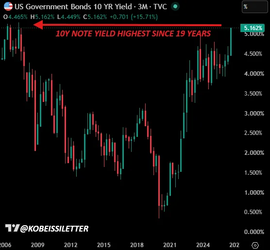
For 3 years, the 2023 peak at 4.99% was the wall nobody could climb. This quarter, bonds just walked through it.
Bonds are trading as if the Fed were hiking 50 basis points at a time. The Fed moved 25.
In 1994, the 10-year went from 5.8% to 8.0% in 9 months. The S&P lost 1.5%, the bond Aggregate 2.9%, its worst year on record at the time, and USD/JPY fell 11%.
In 2007, it peaked at 5.32% in June. The S&P squeezed out another 7%, then fell 57%, while EUR/USD climbed from 1.34 to 1.60.
In 2022, it went from 1.5% to 4.24%. The S&P lost 19.4%, the Aggregate 13.0%, and EUR/USD sank to 0.95.
In 2023, from 3.3% to 4.99%. The S&P lost 10.3%, and USD/JPY pushed to about 150.
2 patterns jumped off the page.
No fast repricing ever left equities untouched. The gentlest hit was -10%.
And every time, the currency that funded the world, the yen or the euro, moved 10-15%.
This time, the currency on the move is the dollar itself. Chart 6 shows how that rewires everything.
Last week, Jim Reid’s work pointed to 6.0% by spring 2027 and 6.4% at the peak. A move to just 5.50% would cost a 20-year Treasury holder about 5%.
But the nominal yield isn’t what keeps me up at night.
It’s the part of it that has nothing to do with inflation.
⚖️ The line I watch most has just been crossed
If I could keep only 1 chart on my desk, it would be this one.
The black line is the 10-year real yield, the price of money after inflation. It’s now at 2.60%.
The blue lines are what the economy can afford. R*, the neutral rate, sits at 1.65%. Real potential growth is around 2.2-2.5%, and the CBO sees it drifting toward 1.8% by 2033.
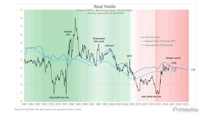
Real yields now sit roughly 100 basis points above neutral and, crucially, above growth.
I think of it like a household.
As long as your salary grows faster than your mortgage rate, the debt slowly shrinks. The day the rate overtakes your salary, the debt starts growing faster than you can pay it.
With US debt at about 100% of GDP, that’s not a theory. It’s arithmetic.
Fidelity marks the last 3 times real yields reached growth.
1994 was a rate shock. The S&P lost 1.5%, then gained 34% in 1995, while the 10-year fell back to 5.6%. Mexico paid the bill: the peso lost 50%.
2000 was a growth shock. The S&P lost 49%, the 10-year fell to 3.1%, and EUR/USD rallied 66% from its 0.82 low by 2004.
2007 was a credit shock. The S&P lost 57%, the 10-year dropped to 2.1%, and the DXY surged 24% in 4 months.
3 out of 3 ended in a shock. The surprise was the epilogue.
Every single time, the 10-year fell 240 to 370 basis points within 24 months. The villain of the story became its hero.
The bull case: if AI lifts productivity growth to the late-1990s 2.5-3%, the math works again.
But in 1994, debt/GDP was about 47%. Today it’s about 100%.
Same shock, 2x the debt.
So who pays when the math doesn’t work? History’s answer is very specific, and it isn’t the government. You’ll find it in chart 8.
🏛️ The market is calling the Fed’s bluff
On September 16, the Fed drew its map for the years ahead.
4.125% at the end of 2026 and 2027. 3.875% in 2028. 3.625% in 2029. 3.25% in the long run.
The market read the same map and walked the other way. Futures price 4.26%, 4.80%, 4.91%, then about 5.18% in 2029.
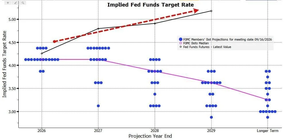
That’s a gap of ~68 basis points in 2027, ~104 in 2028 and ~155 in 2029.
The 2 sides aren’t arguing about the next meeting. They’re arguing about where this whole cycle ends.
It felt like poker, so I looked for other hands where the market called the Fed.
In 1994, the Fed promised gradual tightening and then went from 3% to 6% in 12 months. The S&P lost 1.5%, and the DXY 8%.
In 2004-06, a “measured pace” turned into 17 hikes, from 1% to 5.25%. The 10-year rose only about 50 basis points, Greenspan’s famous conundrum, and the S&P gained about 11%.
In December 2018, the dots showed 2 hikes for 2019. The Fed cut 3 times instead, and the S&P gained 28.9%.
In March 2022, the dots showed 1.9% for year-end. Fed funds finished at 4.375%, the S&P lost 19.4%, and the DXY rallied as much as 20%.
The market got the direction right every time. What decided the outcome was who was the hawk.
When the market was the hawk and right, in 1994 and 2022, equities went flat or negative. When the Fed was the hawk and wrong, in 2019, equities soared.
Today, the market is the hawk.
As long as futures sit 100+ basis points above the dots, every strong payrolls, CPI or ISM print will land like a hawkish surprise.
So what does the market know that the Fed isn’t saying?
It’s less about inflation and more about who’s still willing to buy Treasuries. That’s where the PRO section begins.
⏱️ It’s the speed, not the level
130 km/h on a motorway is fine.
0 to 130 in 3 seconds throws everyone against their seats.
This chart measures that jolt.
Goldman sorted every month since 1990 by how violently the 10-year moved.
When yields rise slowly, up to 1 standard deviation, the S&P gains +0.6% to +1.1% a month. Between 1 and 2, roughly zero.
Beyond 2 standard deviations, stocks lose 1.1% on average for nominal moves. When the move is in real yields, the average loss is 4.1%.
Today 2 sigma means 40-50 basis points in a month, or 30 in 2 weeks. When Goldman ran the numbers, we were at 35 and 25.
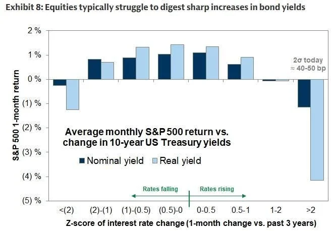
15 and 5 basis points from the trigger. And the engine behind this move is real yields, the one that hurts most.
In February 1994, the 10-year jumped about 60 basis points in a month, and the S&P lost 8.9% in 2 months.
In the 2013 taper tantrum, it went from 1.63% to 2.60% in 6 weeks. The S&P lost 5.8%, USD/INR jumped 25%, and gold ended the year down 28%.
In early 2018, from 2.46% to 2.95%, and the S&P lost 10.2% in 9 days while the VIX leapt from 11 to 37.
In autumn 2023, another 60 basis points, and another -10.3%.
The average of those 4 drawdowns is about -8.8%, roughly 7,030 from here. Goldman’s -4.1% average takes us to about 7,390.
And last week I found 7,170 from the valuation squeeze and 7,200 from the UBS hiking-cycle path.
The 7,200-7,400 zone keeps showing up. 4 methods, 1 place.
What I can’t tell you from these 5 charts is whether that zone is a floor or a trapdoor.
In 1994 it would have been a floor. In 1999, a trapdoor.
The difference comes down to 4 things I haven’t shown you yet: a dollar breaking out of a 17-month cage, a gold price that should be falling and isn’t, an interest bill Washington can’t afford, and a correlation I haven’t seen since 1997.
This is where I stop describing the storm and start explaining it.
From here on, it’s no longer about what is happening. It’s about which ending we’re in, and what I’m doing about it.