
Dear Investors,
On Wednesday night I switched off my screens later than usual and stared at a blank page in my notebook.
It wasn’t the hike. Everyone saw the hike coming.
What kept me awake was a number. I found it 3 times, through 3 methods that have nothing in common. One is built on valuation. One on 75 years of Fed cycles. One on what 122 professional investors told Bloomberg last week.
All 3 landed within 200 points of each other on the S&P 500.
Once is a coincidence. 3 times is a signal.
9 months ago, the market was pricing 3 rate cuts for 2026 and oil was at $60.
On Wednesday, the Fed raised rates to 3.75%-4.00%, its first hike since July 2023. Oil is above $100. Diesel is at record highs. And the 10-year closed at 5.01%, a level I hadn’t seen on my screen since 2007.
That’s how fast a regime can change. Not in years. In 9 months.
The first 5 charts describe the cycle we’ve just walked into. You could have assembled most of them yourself this week.
Stop after those 5, and you’ll close this page informed, a little uneasy, and invested exactly as yesterday.
The last 4 are the reason I’m writing at all.
Why is the 30-year soaring while inflation expectations haven’t moved an inch since March? What does it mean that the cushion protecting equities has shrunk to roughly zero, for the first time in 26 years? Why is one of the most anchored numbers in finance leaning against a line it hasn’t broken since 2008?
And what is the number that kept me awake?
I’ll leave a few doors half open along the way. I’ll close every one of them in the PRO section.
Let me start where the story looks brightest.
💰 Earnings are doing everything right. Multiples are doing the opposite
Show me only the blue bars, and I’d tell you to buy everything.
S&P 500 earnings are growing at +28% Y/Y, the fastest since the 2021 rebound, when growth hit +50%. And the rate of change is still rising.
Then come the pink bars. The P/E is down 9%, to roughly 20x.
Fidelity drew 2 black boxes on this chart.
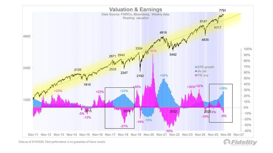
2018. Earnings grew +23%, the P/E compressed by 27%, and between September and December the S&P fell 19.8% and the Nasdaq 23.6%, with record profits. The 10-year had peaked at 3.24%, the dollar index had gained about 10%, and EUR/USD had slid from 1.25 to 1.12.
Then there’s a ghost that isn’t boxed: 2022.
P/E down 35%. S&P down 25.4%. Nasdaq down about 36%. The 10-year up to 4.24%, the dollar index up about 20% to 114.8, EUR/USD below parity at 0.95.
Same recipe both times: rising yields and a surging dollar. Earnings didn’t save anyone.
The S&P lost 18.1%, and the US Aggregate bond index lost 13.0%, its worst year on record. The umbrella got wet with you.
When inflation runs above roughly 3%, stocks and bonds stop protecting each other, as they did for most of 1970-1999. With core PCE at 3.4%, I’m not counting on that umbrella this time.
At 7,791 and 20x, the index discounts roughly $390 of earnings.
If growth cools toward 15% and the multiple slips to about 18x, I get ~8,060. A 2018-style squeeze to about 16x gives me ~7,170. A 2022-style squeeze to about 14x, with 10% growth, lands near ~6,000.
That last one isn’t my scenario. But circle the middle number, 7,170. It’s the first of the 3.
AI capex is the single reason earnings are outrunning the Fed.
And keep in mind that the S&P has rallied +61% from the 4,835 low of April 2025 and +23% from the 6,317 low earlier this year. That +23% returns in chart 4.
Why is the multiple falling when earnings are this strong? The uncomfortable answer is waiting in chart 6.
First, the institution that just changed the rules.
🏛️ The Fed just told you it is not in a hurry to stop
I skip the Fed’s headlines and read the revisions. That’s where it confesses what changed in 3 months.
GDP for 2026 up to 2.3% from 2.2%. PCE inflation up to 3.7% from 3.6%, core to 3.4% from 3.3%. Unemployment down to 4.1% from 4.3%.
Stronger growth, hotter inflation, a tighter labor market. A single number arguing for a pause? I found none.
The dots are even blunter.
4.1% at the end of 2026, from 3.8%. 4.1% for 2027, from 3.6%, a jump of 50 basis points. 3.9% for 2028, from 3.4%.
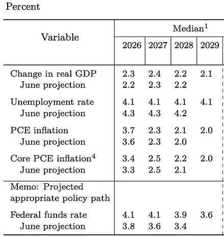
And 16 of 18 participants expect another hike before year-end. Core PCE doesn’t touch 2.0% until 2029, about 8 years above target.
The vote was 12-0, the first unanimous decision since May 2025.
The problem is who’s standing on the other side.
12 days ago, President Trump threatened to stop trading with 50+ partners if the Fed didn’t cut. After the decision, he said rates should be 1% or less. Powell is gone, Warsh is in the chair, and the gap with the White House has never looked this wide.
With fed funds at a 3.875% midpoint and core PCE at 3.4%, the real policy rate is roughly +0.5%. A Fed tapping the brakes, not slamming them.
Between 1974 and 1978, under political pressure, Burns kept real rates between -2% and -4%. Inflation roared back to 13.3% by 1979, the S&P lost 11.5% in 1977 alone, and the dollar index lost about 17% between 1973 and 1978.
Then Volcker arrived and pushed real rates to +4% to +8%. Inflation fell from 14.8% to 3.2%, the dollar index rallied about 90% to 164.7 in February 1985, and the S&P gained 229% between August 1982 and August 1987.
Real rates and the dollar walk hand in hand. Positive real rates bought the dollar a 90% rally. Negative ones, under a pressured Fed, cost it 17%.
+0.5% under pressure isn’t a dollar-bullish setup. And the dollar, as you’ll see in chart 5, is the hinge on which almost everything else turns.
Meanwhile, the bond market wasn’t waiting.
📉 The bond market did the Fed’s job before the Fed showed up
Jim Reid at Deutsche Bank tracked the 10-year around every hiking cycle from 1963 to 2022. On average, it barely moved in the 12 months before the first hike.
In 2026, the red line climbed roughly 100 basis points before the hike. Bonds dragged the Fed to the table.
After the first hike, the average path takes the 10-year up 0.7 points by day 146, 1.0 by day 219 and 1.4 at the peak, about a year in.
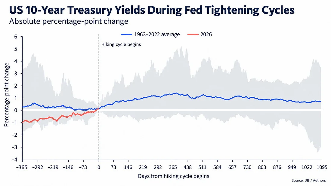
Starting from 5.0%, that’s 6.0% by spring 2027 and about 6.4% at the peak, the highest since 2000. And the grey band reminds me the average is not a ceiling: in the 1970s, the 10-year rose as much as 5 points.
Going back through recent cycles, what struck me wasn’t the yields. It was the currencies.
In February 1994, the 10-year went from 5.8% to 8.0% by November, the S&P gained only 1.9% in 12 months, and USD/JPY fell about 9%.
In June 2004, the 10-year actually fell, from 4.6% to 4.0%, and the S&P gained 4.4%. In December 2015, it went from 2.3% to 2.6%, and the S&P gained 8.9%.
In March 2022, it jumped from 2.15% to 3.6%, touching 4.24%. The S&P lost 9.1%, and the dollar index gained 5%, up to 16% at the peak.
Put 1994 and 2022 next to each other. 2 massacres for bond holders. But in 1994 the dollar fell, and in 2022 it soared.
Rates up, dollar down, against rates up, dollar up. It’s the pairing I wrote about last week, and it’s the fork in the road of this entire cycle.
One odd thing, though. When the long end moves this much before a hike, the usual culprit is inflation fear. Not this time.
In the PRO section I’ll show you who’s really pushing yields up. I think it’s the most underrated risk in the market right now.
Now, where most of you have your money: equities.
🧭 Not all hiking cycles are equal. This one sits in the worst bucket
UBS split every tightening cycle since 1950 into 4 regimes.
On the left side, the 4 lines hold hands: the S&P rallied about 15% in the year before the first hike. We did 23% from the 6,317 low. Textbook.
On the right side, they let go.
Slow tightening: +15% the next year. Low inflation: about +8%. Fast tightening: about +2%. And when inflation was above 3%, the S&P lost 7.5% in 4 months, and was still down about 3% after a year.
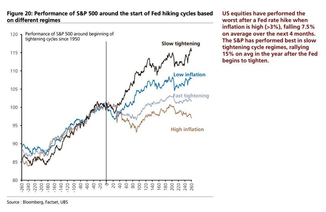
With PCE at 3.7%, there’s no debate. We’re on the brown line.
Applied to 7,791, it takes the index to about 7,200 by mid-January. That’s the second of the 3 numbers. Put it next to 7,170 from chart 1.
But the dots show 1 more hike and a long hold. That’s a slow cycle, and slow tightening historically points to about 8,960.
So 2026 is a hybrid, half brown and half black, and the midpoint after 1 year is roughly +6%, around 8,250.
In 1994, the S&P fell 8.9% between February and April. In 2022, 16% to the June low.
Inside the index, 2022 was a lesson. The S&P lost 18.1% while energy gained 65.7%. Value lost 7.5% and growth 29.1%, a 22-point gap in 1 year.
In a high-inflation hiking cycle, oil stops being a cost and becomes the hedge.
The swing factor is energy. If oil slips back below $100, we drift toward the black line, and 8,000+ becomes my base case. If it stays above, I expect the first 4 months to be the bumpiest.
Which brings me to gold.
🪙 Gold: weak before the hike, strong after. With an asterisk
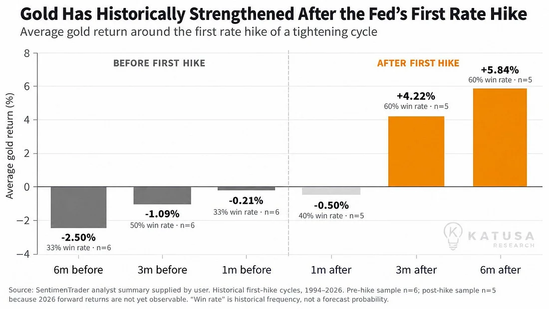
Across the first hikes from 1994 to 2026, gold fell on average 2.50% in the 6 months before.
After the hike, it lost 0.50% in the first month, then gained 4.22% at 3 months and 5.84% at 6, with a 60% win rate. If history rhymes: chop into mid-October, about +4% by mid-December, about +6% by mid-March 2027.
5 cycles, so 60% means 3 out of 5. So I took it apart.
After February 1994, gold at about $383 went nowhere, while USD/JPY lost about 8%. After June 1999, gold at $262 gained around 10%, with the dollar flat.
After June 2004, gold at $395 gained 11%, as the dollar index lost 9%. After December 2015, gold at $1,062 gained 22%, with the dollar down 4%.
After March 2022, gold at $1,925 lost 13%, while the dollar index rallied 12%.
1 pattern jumps out. Every time the dollar was flat or weaker, gold was flat or higher. The only time the dollar rallied by double digits was the only time gold lost double digits.
The Fed’s hike doesn’t write gold’s next 6 months. The dollar does.
Gold’s tight link to real yields broke in 2022, when central banks started buying more than 1,000 tonnes a year, 3 years running. Gold now has a buyer that doesn’t care about real rates.
So everything funnels into 1 question. 2015 or 2022? Will the dollar follow rates up, or walk the other way?
The first 5 charts can’t answer that. The next 4 can. And what I found there changed how I read everything above.
This is where I stop describing the cycle and start explaining it.