
Dear Investors,
Over the last few days, as I went through the charts I’m sharing with you today, I kept coming back to the same thought: this is not a market sending a single message. It is sending several messages at once especially on gold.
And when that happens, I find it dangerous to focus on any one chart in isolation. I want to understand the sequence. I want to understand the emotional logic of the market, the macro logic of the economy, and the historical logic that ties today’s numbers to what investors have lived through before.
What I see right now is not yet a full capitulation event. It is not a clean recession trade or a classic inflation breakout.
It is something more subtle and, in some ways, more difficult: a transition.
A transition from a market that had grown comfortable with resilience, disinflation, and the idea that setbacks would remain buyable, toward a market that may soon have to price a much less forgiving mix of slower growth, firmer inflation pressure, tighter correlations, and much harder policy choices.
That is why I want to walk through this with you carefully. Not as a list of isolated observations, and not as a technical note full of detached conclusions, but as one continuous story.
Because to me, that is what these charts have become: a story about how optimism begins to meet constraints.
A Market That No Longer Feels as Comfortable – Gold
I want to begin with the Nasdaq, because it is often where the emotional temperature of the market shows up first.
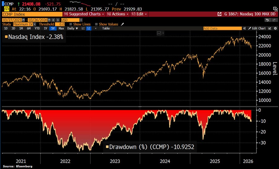
The chart tells us that the Nasdaq has moved into roughly a -10.9% drawdown, and on a recent session the index was down around -2.4% on the day.
I could describe that as a correction and move on. It is not the deepest drawdown we have seen in recent memory, it is not 2020, it is not even 2022.
But when I look at it, I don’t see just a percentage decline. I see it in the context of who owns risk, how crowded the positioning has become, and how differently a market behaves when optimism is already deeply embedded.
That is why the statistic on US households matters so much to me
US households now hold a record 52% of their financial assets in equities. That figure has more than doubled from the post-GFC period and now sits roughly 5 percentage points above the dot-com bubble peak.
I find that astonishing, not because it guarantees an imminent crash, but because it tells me how little emotional and financial distance there is now between investors and the market itself.
Households are not cautiously observing this cycle. They are inside it, exposed to it, participating in it at a historically elevated level.
When I see that kind of ownership concentration, I immediately think about fragility. Not panic, not doom, but fragility.
A market can hold extreme positioning for longer than most people expect, but once disappointment enters the system, it tends to move through a crowded market much faster.
There is less sideline capital, less skepticism left to be converted into buying power. There is more exposure already in place, which means that a normal correction can start to feel less normal if confidence weakens even modestly.
History helps me frame this
In the early phase of the 2000 dot-com unwind, the Nasdaq fell roughly -39% in the first major leg lower before the broader collapse became much deeper.
In 2022, the Nasdaq lost about -33% for the full year, while the S&P 500 fell roughly -19%. But what I think matters even more than those equity numbers is what happened around them.
In the early 2000s, slowing growth and falling inflation allowed Treasury yields to decline, which meant bonds could still play their traditional defensive role.
In 2022, inflation broke that historical protection. Stocks fell, bonds fell, and the traditional diversification model offered far less shelter than investors were used to.
This is the first big question I keep asking myself now: if this drawdown deepens, what kind of drawdown will it become?
If the market moves toward a classic disinflationary slowdown, Treasuries can still hedge risk. If it moves toward an inflationary slowdown, then the relationship between equities and bonds becomes much more dangerous. To me, that is not a technical distinction. It is the central distinction. Because when households already hold 52% of their financial assets in equities, the difference between a hedged correction and a correlation shock becomes enormous.
And then, just as I begin to think about whether this is simply an equity valuation reset, the next chart changes the tone completely.
When Oil Starts Rewriting the Entire Macro Script – Gold
The oil chart is the point at which, for me, this story stops being an ordinary market pullback and starts becoming something larger.
Brent crude is up roughly 70% in five weeks. That is not a casual move. That is not background noise. That is a violent repricing of one of the most important inputs in the global economy.
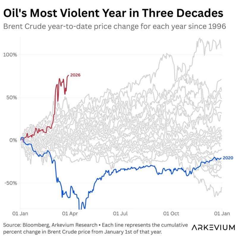
The natural comparison, of course, is 2020, because that was the last time oil moved with this kind of violence. But the more I think about it, the more I believe today’s comparison to 2020 is useful only because it highlights how different the current shock really is.
In 2020, the world was dealing with demand destruction, excess supply, and an outright collapse in activity. It was a deflationary shock. Today, the message feels completely different.
This time, the move is being driven by tighter supply, geopolitical tension, and a growing awareness that energy prices can stay elevated even as growth begins to lose momentum.
That difference changes everything
A demand collapse tends to weaken inflation pressure and eventually support bonds. A supply shock does almost the opposite. It puts inflation back into the bloodstream of the economy at precisely the moment when growth is losing momentum.
That is why oil can be so dangerous here. It is not just an energy story. It is an inflation story, a policy story, an earnings story, and a cross-asset correlation story all at once.
I think back to 1990, when the Gulf War shock pushed oil sharply higher and the S&P 500 suffered a fast drawdown of roughly -17% before recovering once the shock eased.
I think about 2022, when Brent rallied more than 30% in a relatively short period after Russia invaded Ukraine. European equities lagged badly. EUR/USD continued to slide until it eventually approached parity later that year.
That is the classic signature of an imported energy shock: oil rises, growth-sensitive assets struggle, inflation becomes harder to suppress, and currencies dependent on external energy stability begin to weaken.
This is why I cannot see the oil chart as just one more market anecdote. To me, it is the hinge on which the rest of the narrative turns.
Positive correlation
That becomes even clearer in the next chart. Over the last 30 days, oil has shown a positive correlation of 0.45 with the US dollar, while its correlation with bonds is around -0.67, with the Chinese yuan around -0.58, with developed market equities around -0.55, and with emerging market stocks around -0.41.
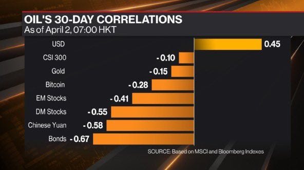
I find those numbers extremely revealing. In a healthy reflation phase, I would usually expect rising commodities and stronger risk appetite to move together.
I’d expect cyclicals to participate, expect the dollar to soften rather than strengthen and I’d expect the move to feel constructive.
That is not what this feels like.
To me, this looks much more like stress inflation than clean reflation.
Oil is rising, but the rest of the market is not celebrating it as evidence of stronger global demand. Bonds are uncomfortable. Equities are uncomfortable. The yuan is under pressure. Even the fact that oil is positively correlated with the dollar tells me that the market is reading this as a global stress signal rather than a benign commodity upswing.
That distinction matters because it completely changes how I think about leadership.
In stress-inflation environments, energy-linked assets can outperform, while growth-heavy parts of the market come under more strain.
Bond yields can become harder to anchor. FX markets begin to reflect vulnerability, not just opportunity.
Even where oil would normally support commodity-linked currencies such as the Canadian dollar or Norwegian krone, the dominance of the broad dollar can overwhelm those cleaner relationships if investors are treating the oil move as a systemic shock.
And once that happens, the next question naturally becomes: what does the bond market do, and what does the Fed do, when the economy begins to soften into an inflation problem instead of away from one?